Book covers. Do they matter?

Bartleby

Moderator
Now let’s just get something immediately out of the way. The text of a book is what should matter first and foremost, always. Even if the cover looks like these.

What prompted me to create this thread was this article on Fitzcarraldo editions and how they aim for a simple style to focus on the quality of the text itself (also to allow them to publish translated books cheaper):


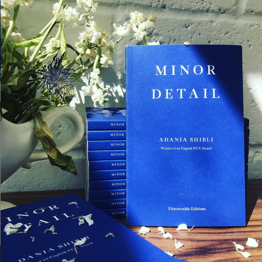
It’s an interesting and noble view, although I find it oddly contradictory at times, as the founder of the company says: “We wanted to design the books to make them visually striking and desirable as objects, because that’s how we believe books will survive in the new media age”, or the writer of the article praising the books’ looks for their collectability; I mean I would find a row of identical blue (fiction) or white (essays) spines on a shelf anything but appealing (even tho blue is my favourite colour). But I guess it all comes down to taste. And that’s the subject here.

What are your views on book covers? Were you to choose to buy the same printed text in a more beautiful clothing, would you go for that? Or does it not matter to you?
 
Last edited:

hayden

Well-known member
What are your views on book covers? Were you to choose to buy the same printed text in a more beautiful clothing, would you go for that? Or does it not matter to you?

If there were two copies of the same book in front of me, same price, same everything, but with two different covers, and one is butt ugly and the other one isn't, then I'd go with the latter.

I think book covers matter. Not as much as the text of course, but they still matter. I've lived in France for periods of time, and when you walk into bookshops you'll find nearly every novel on the shelves has that exact same beige-ish jacket with a simple border, and I've gone back-and-forth on whether or not I like the idea. On one hand, you 'don't judge the book by its cover', and on the other hand... well, it is rather boring and uninspired. Almost like a dress code. Cocteau's novels usually stand out quite a bit because of his original artwork on the covers.

At the end of the day, I like good book covers. I'd much rather a book had a good book cover than a bad one. I'll put it that way.
 

Liam

Administrator
I would find a row of identical blue (fiction) or white (essays) spines on a shelf anything but appealing
Yeah but these editions wouldn't be the ONLY set of books in your library, correct?

The spines of Penguin Classics and Oxford World's Classics and the (very appealing) orange hardcovers of Everyman's Library are pretty uniform as well. I for one admire the simplicity of these blue-and-white editions.

I completely agree with the publisher's distaste for "sickly puff quotes and image-heavy visuals," the perpetual bane of most American publishers. To put it bluntly, I don't give a f*ck about what Author X thinks about Novel Y; if I want to read a book review I will go and read the book review; don't put any of it on the cover (either front OR back).

This behavior is especially prevalent among a certain group of Brooklyn-based authors: they just keep reviewing each other's bland unimaginative prose ad nauseam, without realizing just how ridiculous it all looks.

That being said, I must confess to not owning a single Fitzcarraldo edition, perhaps because most American bookstores do not carry them? ?
 

Bartleby

Moderator
Yeah but these editions wouldn't be the ONLY set of books in your library, correct?
Sure, I just meant to say that if I were to collect them, like lots of them, seeing a block of striking blue books next to each other (because of course I would arrange them by publisher hehe) would seem strange to me...

the black penguin paperbacks, because they’re more neutral perhaps, I have no problems with

guess it’s also to do that the fitzcarraldo ones are JUST blue (or white). I like me some pictures on the cover :p

I completely agree with the publisher's distaste for "sickly puff quotes and image-heavy visuals," the perpetual bane of most American publishers. To put it bluntly, I don't give a f*ck about what Author X thinks about Novel Y; if I want to read a book review I will go and read the book review; don't put any of it on the cover (either front OR back).
hate that as well. Especially on the front cover, and those announcements that book x got y prize (tho I don’t dislike it when it mentions it’s by a Nobel laureate).


If there were two copies of the same book in front of me, same price, same everything, but with two different covers, and one is butt ugly and the other one isn't, then I'd go with the latter.
Guess I should’ve added that the prettiest one would be more pricey Hehe
 
Last edited:

Liam

Administrator
of course I would arrange them by publisher hehe
?

LOL.

You should post pictures of that hardcover you recently bought: that gold-and-gray German novel? I thought it looked delightful, though you only showed me the front (what does its spine look like, for instance?)
 

tiganeasca

Moderator
"Fitzcarraldo." Sorry, but I can't hear that name without thinking of the great Werner Herzog/Klaus Kinski movie.

But I digress. I had actually been toying with the idea of starting my own thread of very nearly this subject. In the course of doing some maintenance work on my Library Thing account, I noticed in a way that I somehow hadn't before the enormous variety of different covers for the same work. Looking at the different images, it's hard to believe that whoever selected the cover even read the book or has a clue about it. Or, everyone has the same stupid idea: "Hey, let's put an image of a wolf on the cover of Hesse's Steppenwolf." After that has been done thirty or forty times, it somehow doesn't seem original any longer. ?

That said, there's always room for a thoughtful, well-considered, attractive cover. I happen to enjoy the overall design and covers for most of the books published by Archipelago. And even the Oxford World Classics can be nice. While I understand hayden's comment about the simplicity and "plainness" of the French covers, I find them often quite attractive. Without going down into my stacks, the first name that pops to mind is Gallimard. That said, I have a bunch of Albin Michel with utterly utilitarian, identical spines that feature unique, attractive covers.

I won't even go to the issue of blurbs. Long, long time ago, we used to refer to a certain publication as the New York Review of Each Other's Books.
 

Bartleby

Moderator
?

LOL.

You should post pictures of that hardcover you recently bought: that gold-and-gray German novel? I thought it looked delightful, though you only showed me the front (what does its spine look like, for instance?)
hehe, I actually arrange my books by author in general, except when a book by said author is part of a collection of similar design. I despise those shelves that put each author in a different place just to create a rainbow effect... it makes me extremely uncomfortable. Like the bookchemist’s.
***​
Oh, the book. The back looks exactly like the front ?
Except on the front the gold letters spell out the book’s title, with the author’s name in relief; the back is the opposite.

and sure, here they are. It’s Anton Reiser, by Karl Philipp Moritz, which I got to know because of Handke (Both parts of his Short Letter, Long Farewell have excerpts of the late 18th century novel as epigraphs).

E078FAEF-043D-4BA2-89CE-0FF26EDF7A11.jpeg
1473DEC5-50F7-469E-8A01-58D6106532EA.jpeg
D5B9DF42-3C9F-484B-8DD3-CE5C400F8BF6.jpeg
Bought it Friday, in a (safe, don’t worry) outing to the mall (I just needed to enter a bookshop!), as a self-given birthday present (bday’s tomorrow, I share it with Borges <3). It’s a very pricey book, but, at least so far, by its looks alone, it was worth it ?
***​
I should also answer my own question. Since I read mostly on kindle nowadays, if I am to pay for a physical book, after I check the translation of course, I will go for looks. The prettier the better. If I’m not sure I’ll like the book or if it’s the only option available, I’ll go for a simple penguin paperback, for instance. Or old editions of out of print books.
 
Last edited:

Stevie B

Current Member
When I buy a book, looks are important. Does that make me shallow? ? The majority of the hardcover books in my collection are UK editions exactly because I think UK publishers typically care more about the aesthetics of dust jacket design. I'll also often opt for a paperback copy if neither the U.S. nor the UK hardcover edition has an appealing design. For me, appreciation of the beauty of books is one of the reasons I was inspired to begin building a collection.. By the way, there's nothing worse than falling in love with the cover design of a book then later disliking the book upon reading it. When this happens, I don't keep the book, though it pains me to remove it from the shelf.
 

Liam

Administrator
By the way, there's nothing worse than falling in love with the cover design of a book then later disliking the book upon reading it. When this happens, I don't keep the book, though it pains me to remove it from the shelf.
Yes, like the original American hardcover edition of Ishiguro's The Buried Giant, which is a work of art in terms of its production values; too bad the book ended up being a bunch of painful mumbo-jumbo that I couldn't force myself to care for, ?
 

Bartleby

Moderator
Yes, like the original American hardcover edition of Ishiguro's The Buried Giant, which is a work of art in terms of its production values; too bad the book ended up being a bunch of painful mumbo-jumbo that I couldn't force myself to care for, ?
Oh, I’m so hyped about that one! Hope I enjoy it as much as my preconceived notions of it make me think it’ll be great.
 
Last edited:

hayden

Well-known member
Guess I should’ve added that the prettiest one would be more pricey Hehe

I'm cool paying a little more for a better cover, especially if it's original art. If I saw a copy of To The Lighthouse with this cover—

ToTheLighthouse.jpg


For, I don't know, let's say $20, compared to this cover—

41cjdwHQIGL._SX302_BO1,204,203,200_.jpg


For let's say, a discounted price of $3. I'd go with the one that's $20, even though it's 650% more expensive.

Legit. I mean it. If it's on my shelf, it may as well look good.

(those prices are made up obviously, just to make a point)

While I understand hayden's comment about the simplicity and "plainness" of the French covers, I find them often quite attractive.

Yeah, I don't hate them by any means (hence the back-and-forth). They're plenty better than most, and at least they're not embarrassing. I hate hardprinted accolades on front covers. It's just tacky. Quotes are worse. My comment on that was mainly just to toss out another example of uniformity like what Fitzcarraldo's doing.

Yes, like the original American hardcover edition of Ishiguro's The Buried Giant, which is a work of art in terms of its production values; too bad the book ended up being a bunch of painful mumbo-jumbo that I couldn't force myself to care for

That's a great book cover. Maybe even his best. Definitely not his best writing, but I'm surprised with how many dislike it. I thought it was a perfectly fine (but perhaps somewhat light) fantasy story.

By the way, there's nothing worse than falling in love with the cover design of a book then later disliking the book upon reading it. When this happens, I don't keep the book.

That's happened to me at least two or three times with blind purchases :(
 

Stevie B

Current Member
41cjdwHQIGL._SX302_BO1,204,203,200_.jpg


For let's say, a discounted price of $3. I'd go with the one that's $20, even though it's 650% more expensive.

Legit. I mean it. If it's on my shelf, it may as well look good.

(those prices are made up obviously, just to make a point)


Yeah, I don't hate them by any means (hence the back-and-forth). They're plenty better than most, and at least they're not embarrassing. I hate hardprinted accolades on front covers. It's just tacky. Quotes are worse. My comment on that was mainly just to toss out another example of uniformity like what Fitzcarraldo's doing.


That's a great book cover. Maybe even his best. Definitely not his best writing, but I'm surprised with how many dislike it. I thought it was a perfectly fine (but perhaps somewhat light) fantasy story.


That's happened to me at least two or three times with blind purchases :(
Wow - that second design of the Woolf cover is just awful. Looks like the publisher just did a Google search for "lighthouse" and then copied and pasted. Going for the obvious in choosing a cover image shows no imagination. It reminds me of the title of a Harvey Keitel film I watched years ago - The Bad Lieutenant. You guessed it, the film was about a police lieutenant who was really bad.
 

Bagharu

Reader
Book covers mean a lot to me. After the writing, the most important thing it is (and the paper ?). There's been many instances when I roamed around from one store to another to find a better cover of the same book, (for instance Rabindranaths Shesher Kobita or Aranyak by Bibhuti). I love thought provoking book covers, that reflect the writing it so intimately embosoms. I mean, historically, they are there to embellish the writing, so a 'halfassed-outofcontext-howdazzlingam-I' cover just shows that to the publisher the book is simply a money-making business (yeah, cut my pocket, but give me the value in return).
There's that, no good reader judges the book for its cover, I suppose like me:))) they too know what they are looking for. But hey, book covers are a form of art, and if you are going to spend some money, why don't get a piece of art instead of a 'crap'?
(Look at the cover of 'War and Peace' below, I beg your pardon for posting this abomination)
war.jpg

edit: of I found another 'aesthetically' failure of an cover!
war a.jpg
 
Last edited:

Liam

Administrator
I think The Buried Giant reads better as allegory rather than straight-up fantasy--an allegory about historical trauma and the danger(s) of forgetting that trauma (though also the necessity to forget it). I may have been a little unfair to the book, it just struck me as "light"--perhaps TOO light, given the fact that it's Ishiguro.

@Bagharu: those look like movie tie-in editions; I've always hated those! A weak attempt on the part of the publisher to remain relevant, as if classics must somehow compete with cinema and television (don't get me wrong, they DO, but it's still such a cop-out!)

@hayden: I have To the Lighthouse as an Everyman's Library hardcover, and it's beautiful; very tastefully done with a photo of Woolf herself on the front cover.

And yes, that Moby Dick cover is iconic--they're now putting it on shoulder bags, etc. Great stuff.
 

Liam

Administrator
Come to think of it, the question of good cover art applies not only to books but to music and film as well. I've been admiring the Criterion Collection team for many years for creating cover art for their film releases that is not only true to the original content but also quite unique in its own right (even when they use a "still" from the movie itself: it's always very creative). I'll post a few favorites below.
 
Top